A version of this paper appears as a chapter in Design
Research: Methods and Perspectives
Brenda Laurel, Editor
Cambridge, MA: The MIT Press, 2003
Sensory Anomalies
Michael Naimark
Mediated Sensory Experience
Mediated sensory experiences are
never perfect, in terms of being indistinguishable from unmediated
first-hand experiences. These imperfections, the sensory anomalies,
range from distractions and violations to poetry and metaphor, depending
on the complex relationships between media, content, and audience.
For new media, these relationships are largely unexplored: we learn
as we go.
The single biggest
difference between first-hand and mediated experiences is whether
sensory anomalies exist. There are none in first-hand experience.
Such anomalies always have explanations: the window allowed me to
see but not hear, the ventriloquist is talking not the dummy, and
the elevator changed floors when the door was closed. The physical
world obeys the laws of science. When
we experience anomalies in the physical world, it's due to human
hardware or software issues, such as blindness or psychosis, not
because of the environment.
Now consider montage. In the blink
of an eye, the movie audience is transported across space or time,
an entirely impossible event in the physical world. The same holds
for optically changing scale, for compositing together different
audiovisual elements, and for generating photo-realistic fantasy
characters and places. We would question our senses, or our minds,
if we saw a giant human head staring through our living room window,
or if we came upon the Eiffel Tower in a cornfield, or if Bugs Bunny
hopped by. But we totally accept, indeed enjoy, such anomalies in
the movies and in other media. These anomalies are intentional,
meant to create metaphor and poetry.
"Virtual Reality", in its theoretical
construct, is the merging of the feeling of first-hand experience
with the freedom from physical-world constraints. The ultimate VR
experience may have dungeons and dragons, it may have "cartoon physics,"
or it may simply transport us to another place or another time.
In all cases, the goal is indistinguishability from first-hand experience
in the physical world: "just like being there." Such VR doesn't
exist and may never (at least not without electrodes). So for now,
we live with even the best sensory media having some degree of anomalies.
These anomalies are not intentional, and entire industries exist
to make higher resolution cameras, better synthesized lighting models,
and auto-stereoscopic displays. The goal is not about creating metaphor
and poetry but about re-creating a multi-sensory experience that
is as consistent as possible.
So some anomalies in sensory media
are intentional while others are not.
What gives?
Rather than propose Big Answers, I
present here a series of small observations. Over the past two decades
I've explored how new media technologies can expand "sense of place".
These projects, being experimental
in nature, have been opportunities to both transcend and exploit
sensory anomalies, and to watch what happens. Here are some notes
and observations about these projects from which readers may draw
their own conclusions.
Anomalous Space
1) Dome Projections

Like montage, mediated experiences
may offer ways to experience space one might consider superior to
unmediated experiences, anomalies be damned. Some work, some don’t,
and there’s no way to know except by experiencing them.
In 1978, as a graduate student at
MIT, a visual riddle became a haunting obsession. Suppose one placed
a 180-degree lens on a camera, pointed it straight up and shot a
picture, then projected it onto a dome with the same fisheye lens.
For viewers inside the dome looking outward, the image would more-or-less
"read" correctly. But what if the image was projected on the outside
of a little dome, and viewers were outside the dome looking inward?
My obsession, particularly at a place like MIT, became contagious
and the subject of cocktail chatter. Some of my colleagues thought
the image would look as natural as sitting in a planetarium but
from a "God's eye" view. Others were convinced the image would be
gobbledygook.
So for the next month, I built a simple
camera and display system. I rented a large, expensive fisheye lens,
mounted it on a Nikon 35mm still camera, and shot lots of images
in a variety of settings and situations (more on this in a moment).
The metal back of the camera was replaced with a custom-made optical
glass mount and the camera was mounted vertically with a strong
light source underneath aimed through the glass. A 36-inch acrylic
dome was sandblasted to act as a rear screen, mounted on top of
the lamp/camera/fisheye lens system, and the processed film was
reloaded into the camera. Voila, and inside-out dome projection!
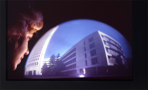
The documentation image shown here
may look impressive, but the reality is that poor Ann Marion, another
MIT graduate student, sees nothing: her eyes are straining to focus
close-up on imagery that is far-field, and the image itself is curving
in all the wrong directions. Some observers claimed partial success
for interior imagery, where the wall and ceiling lines along the
dome's surface could be mentally "flipped" like the Necker Cube
illusion. But for the most part, there was no miracle "inside-out"
illusion many of us hoped for.
The "Dome Projection" did have one
noteworthy feature though. At the time, I was involved romantically
in an intense but confusing relationship. During the week of shooting,
there we were, standing in an embrace, when I reached for the camera,
placed it between our faces, and snapped. The image projected on
the dome shows her face on one side and mine on the other. If this
was projected inside a planetarium, we would indeed be facing each
other, but on my little dome projection, we appear to each be facing
away, backs to each other. "I guess this sums up our relationship,"
she said upon seeing it.
2) Displacements

During the same period, I was exploring
how to add spatiality back into cinema by moving the projector the
same way as the camera moved during filming. That movie cameras
can move but movie projectors don’t is itself an anomaly, and
when a movie projection moves the same way as the original camera
movement, a very natural-looking "flashlight effect" occurs. A simple
demonstration can be made by filming with a movie camera on a slowly
rotating tripod, then projecting the movie on a slowly rotating
turntable. This became the basis for an art installation.
The idea was to design an Americana-style
living room, mostly from Salvation Army furniture, inside the exhibition
space, then film it with a rotating movie camera from the room's
center. After filming, only two changes were necessary: the camera
would be replaced with a loop projector on the same turntable and
the entire contents of the room would be spray-painted white. The
projector would project everything back onto itself, now acting
as a giant, custom-shaped projection screen.
Projecting an image onto a screen
the same shape as the image enlivens it to perfect three-dimensionality.
Such a technique is used by Disney in the Haunted Mansion to project
a woman's face onto a face-shaped mask. This effect is so strong
that small anomalies, such as her moving lips, go unnoticed. Most
people erroneously believe they're viewing a hologram (which, to
anyone in the field, is nonsense).
I produced this living room installation
three times over a four year period, each time walking the plank
a little further away from verisimilitude in favor of sensory anomalies.
The first installation, obediently
entitled "Moving Movie," was almost entirely motionless, insofar
as the rotating movie projector simply projected rotating imagery
of the stationary furniture that occupied three of the four walls.
In what felt like a total violation of the concept, I filmed a performer
walking along the fourth blank wall. Though she added some motion,
and maybe even some emotion, she appeared simply as a flat projection
in an otherwise 3D projection environment.
The following year I produced the
installation again, this time deciding to integrate live performance
even though I was apprehensive of the anomalous look of people in
the movie (especially knowing that I could not paint them white
as well). This second installation, with another general title,
"Movie Room," also had one blank wall, where three performers did
such actions as spray-painting graffiti as the camera panned by.
One insisted on actually sitting on the sofa during filming, to
which I finally succumbed. Another snapped a Polaroid picture and
stuck it on one side of the blank wall during filming. I decided,
after a great deal of "art anxiety," to keep the Polaroid unpainted.
In the end, I was indebted to the performers. The graffiti action
was striking but safe. The performer on the sofa appeared nicely
ghost-like (an anomaly!) on top of the "very real" looking sofa.
And the image of the performer holding the image of the Polaroid,
walking toward the actual Polaroid, and placing it there - witnessing
the moment where the image and object became one - was spine-tingling.
This displacements/convergence anomaly
became the basis for the third installation. This time, no holds
were barred on violating the formalism of 3D representation. Another
living room was installed, this time along all four walls. Lots
of movable props: sweaters to take off, a purse, a globe to spin,
junk food on the coffee table. Two performers were carefully scripted
to move things during filming. Ten rotations were filmed. This installation
was still about adding spatiality to cinema with the rotating and
3D projection, but it was also about the displacements. The piece,
entitled "Displacements," was final.
Anomalous Time
3) Moviemaps

A motion picture film can be viewed
forward or backward at any speed, even though there’s only
one "correct" (non-anomalous) speed, at least if "real-time" playback
is the goal. But motion picture film can be triggered by space instead
of time, measuring "frames-per-feet" instead of "frames-per-second."
Such is a "moviemap."
A moviemap is a kind of interactive
travel experience made by carefully pre-recording paths and turns,
then accessing the material in such a way to give the participant
control of speed and direction. The first moviemap was made of Aspen,
Colorado, by filming up and down every street and filming every
possible turn through every intersection, using a special camera
on top of a moving vehicle, triggering one frame every ten feet
by a fifth wheel. The camera vehicle drove down the center of the
street, and filming took place between 10 am and 2 pm to minimize
shadow difference. The "Aspen Moviemap" was an MIT-based
project two decades ago. I was on the original team and continued
making moviemaps professionally.
In a word, the trick to making effective
moviemaps is seamlessness. Great care must be taken to insure that
the film footage of moving along paths, and particularly, cutting
from a path sequence to a turn sequence and back, is as visually
matched as possible. Driving down the exact center of the streets
and using gyro stabilized camera platforms help, but perfect "match-cuts"
are never perfect.
Consider the anomaly that results
from passing someone walking down the street during filming a moviemap.
Since the control of speed and direction is made by changing the
playback speed of the storage medium (e.g., laserdiscs), the real
time nature of the walking person is lost. If the participant decides
to "travel" slower, the person will appear to walk slower. If the
participant decides to travel backward, the person will appear to
walk backward. One solution is to make sure nothing moves during
filming. The ideal solution is to digitally isolate transient objects
from the imagery, a non-trivial and state-of-the-art problem.
Another time anomaly is sun and shadow.
If a particular path sequence was filmed at 11am one day and a corresponding
turn sequence was filmed at noon, the shift of the sun and shadows
will be apparent. Even a few minutes makes a difference. Cloudy
days help, but less than one might believe.
It’s important to provide enough
visual seamlessness to maintain overall spatial continuity, but
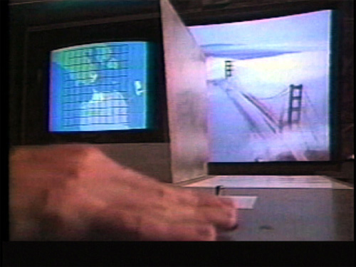
from there, things can be stretched. For example, the "Golden
Gate Flyover" is an aerial moviemap I directed in 1987, on
exhibit at the Exploratorium. We used a gyro-stabilized helicopter
camera and carefully filmed along a ten by ten-mile grid, at one-mile
intervals, from 1,000 feet above sea level, always centered on the
Golden Gate Bridge. Since we could fly at a precise ground speed,
the camera filmed at a slow but constant frame rate equivalent to
one frame every 30 feet. The interface was simply a trackball, and
moving it allowed participants to "travel" over the Bay Area at
speeds topping one mile per second. The result was a "hyper-real"
experience, impossible in the world of first-hand experiences, unless
you’re a super hero.
4) Be Now Here


Another upside of anomalous time,
in theory, is that it allows us to experience more than one slice
of time simultaneously. Consider, for example, a Breugel painting
with dozens of people all in the same scene. Chances are slim that
Breugel looked out his window one day and actually witnessed a hundred
children playing in the street. More likely, his subjects appeared
over time (or in his imagination) and Breugel used a single canvas
to place them all together. A similar phenomenon was incorporated
in my 1995 immersive installation called "Be Now Here."
"Be Now Here" is a stereo-panoramic
installation of public plazas in beautiful but dicey areas, specifically,
UNESCO-designated World Heritage Sites In Danger. Like "Displacements",
a slowly rotating camera was used for filming, but with two cameras
side-by-side for stereoscopic 3D. Unlike "Displacements",
rather than rotating the projector, "Be Now Here" rotates
the audience, who stand on a 16-foot-diameter floor rotating in
sync with the panning scene. The effect is similar to the "moving
train illusion" we've all experienced when the train next to ours
pulls out of the station and we think our train is moving.
For each of the four endangered locations,
five scenes were filmed from the exact same spot, where the tripod
and camera system didn't move a millimeter. The result was perfect
match-cuts from one time of day to another, with only transient
objects and light changing. A simple input pedestal located in the
center of the floor allowed participants to change location and
time of day. Participant wore inexpensive polarized 3D glasses.
Four-channel location sound added to the ambient feeling of "being"
in these four endangered places.
Changing times of day in "Be
Now Here" was magic. Like conventional montage, the world changes
in the blink of an eye. But here, only time changes, while space
stays exactly as it was. If the cameras had moved even a few inches
during production, the magic would have been lost: the perfect registration
of the buildings, trees, and mountains became the visual foundation
on which the time anomalies comfortably rest.
Several years later, the "Be
Now Here" footage was used for a space-time experiment, whereby
three projectors were placed side by side to make a 180-degree composite
image. Since the cameras rotated once per minute, offsetting the
same sequence by 10 seconds resulted in a 60-degree shift, and thus
a 180-degree image can be made with the same footage offset by 10
and by 20 seconds. If the footage contained little motion, the triptych
projection appeared credible. With prominent motion (such as a camel
caravan in Timbuktu), the projection appeared broken due to the
repeated action every 10 seconds on all three screens. But with
lots of non-prominent motion (such as a crowd scene in Jerusalem),
the repetition appeared unnoticeable.
Slightly more daring, it was possible
to make a triptych of the same place but of three different times
of day, as shown here in Timbuktu and Dubrovnik. The sun, sky, and
people dramatically change. But even with such anomalies, the "placeness"
apparently remains.
Anomalous Interaction
5) Karslruhe Moviemap

The hardest part for many artists
making interactive work for the first time is the realization that
the audience matters and that their behavior must be taken into
account. The extreme traditional view is that artists (unlike designers)
work from an internal drive, independent of any audience. Think
Michelangelo or Van Gogh. But the rules change when an interactive
artwork "asks" its audience to participate.
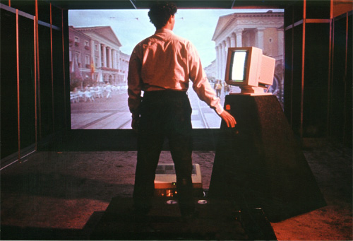
In 1989 I had the opportunity to make
an immersive moviemap installation. Unlike past moviemaps, which
were viewed on a small screen, the "Karlsruhe Moviemap"
was filmed with a wide-angle lens and projected onto a large screen.
The moviemap, based on Karlsruhe's famous tram system, allowed participants
to control speed and to chose which way to go at each track intersection.
A tramcar was used for filming - the camera was triggered by the
tram's odometer - and the tracks assured unrivalled registration
and stability of the footage.
A kinesthetic input system was built
for the installation. Since the immersive image would create a visceral
experience, why not get the whole body into the act? The input system
was designed around a raised floor, with 3 illuminated foot switches
in front to choose left, center, or right directions, and a broomstick-length
speed lever that pivoted forward and backward. Participants held
the lever to control speed and used their feet to control direction.
Bad idea. I watched in amazement and
embarrassment during two public exhibitions, as participants mastered
the speed control but stumbled around the floor looking for the
foot switches. It turned out that it was precisely because of the
hypnotic, immersive quality of the screen, that the last thing people
wanted to do was to look down. By the third show, the raised floor
was replaced with a modest but easy to use pedestal with hand controls.
6) See Banff Kinetoscope

Our senses work together to form a
single integrated experience. Even with some anomalies, a little
bit of parallel support goes a long way. Using a variety of sensory
modalities was explored in a project called "See Banff."
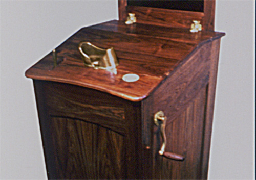
"See Banff" was a stereoscopic moviemap
made in 1993. It was a simple moviemap - single paths only, no turns
- of scenes from the Banff region of the Canadian Rocky Mountains.
A portable camera cart was built from a 3-wheeled "baby jogger"
on which a stereoscopic pair of stop-frame cameras were mounted,
triggered by one of the cart's wheels. Based both on the concept
of parodying tourism and on the technical requirements, the system
was packaged in a hundred-year old style kinetoscope cabinet. It
included a lever for selecting scenes, special 3D optics hidden
in the eye hood, and a crank with which the participant could "travel"
back and forth along the pre-recorded paths. It's the crank that
became the center of anomalous attention.
Since the moviemap sequences were
all of finite length, the question arose of what to do with the
crank when the scenes came to an end. One solution was for the image
to simply go black, but this was unsatisfying. A better solution,
it seemed, was for the crank to automatically freeze. A force-feedback
brake was attached to the crank. When the first or last image of
a sequence was viewed, the brake would switch on and the crank would
lock up.
The effect was so effective that when
the force-feedback was disengaged, something felt wrong. Obviously,
a mental model of film mechanically transported through the device,
with a beginning and end, was strong, and it was amplified when
the eye and hand received consistent signals.
But there was a small problem. The
force-feedback brake was only so strong and could be over-ridden.
An engineer colleague, Bob Alkire, had a curious suggestion: he
said add an audio "pop" in sync with the brake engaging. Easy enough,
so we did. The wooden cabinet was resonant, so the pop could be
felt as well as heard. Magic! The result, based purely on adding
an additional parallel sense, was that people actually thought we
installed a more powerful brake.
But the problem didn't entirely disappear.
Anyone (big males in particular) could still force the crank to
move when the brake was engaged. An even more curious solution was
proposed by Joe Ansel, former exhibit director for San Francisco's
Exploratorium. He noticed that a mechanical bearing coupled the
wooden handle to the crankshaft, allowing participants to grip the
handle while turning it. He said "take it out." Everyone was puzzled.
Joe explained that without the freely rotating bearing, participants
would have to hold the handle lightly, to let it rotate under their
grip. Joe's solution worked like a charm. The "light-handedness"
made the brake feel even stronger. And the cost was, well, a negative
number.
So in the end, the least anomalous
interface required a force-feedback brake added, and an audio "pop"
added, and a mechanical bearing subtracted. Who knew?
Violation or Metaphor?
Sensory anomalies are funny things.
I once slowed down the real-time motion of a film in an art installation
to half speed, resulting in everyone appearing to move in slow motion.
I had my reasons, but a colleague, a well-respected engineer, was
shocked, as if I had violating something.
I had.
Metaphor to some is violation to others.
"Faithful representation" is a noble engineering goal, but things
aren’t quite as clear in art and design. To confuse, or clarify,
things further, good metaphor can often be a form of shorthand.
If we share similar cultures, backgrounds, or personal experiences,
metaphor is a form of abstraction, of compression. So in the end,
the degree of faithfulness and the degree of violation depend on
what we want to say. Sensory anomalies sit on both sides of this
fence.
|